

Typography
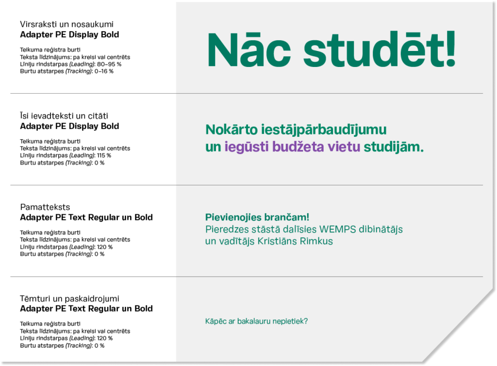
Typography Style Recommendations
Text plays a major role in RTU communication. Form serves the message.
– Content must be clear, concise, and visually quick and easy to read. The reader must be able to quickly distinguish headlines from the body text, which requires a sufficient hierarchy of typeface sizes.
– Headlines and titles should always be larger than the rest of the text. To avoid text compositions that are difficult to read, it is recommended to use no more than 3–4 font sizes within a single design.
– Less important text should preferably be replaced with a link or a QR code directing to a website where more detailed information is available.
Use of Colour in Texts
– Texts must be set in RTU green or one of the supporting colours – black or white. Sufficient contrast between the text colour and the background must be ensured. –
– To highlight words or sections of text, one of the additional colours may be used in headlines and introductory texts. Sufficient contrast between the text colour and the background must be ensured.