

RTU Logo Description
Logo
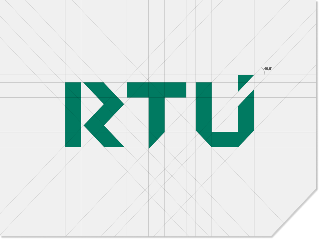
The logo is graphically constructed through the intersection of infinite vertical and horizontal lines, as well as lines positioned at a 46.6° angle.
In its form, it is dynamic and solid; it symbolises and unites constructivism, development, and vision Its shape is strong and faceted, visually combining constructivism, development, and vision.
The typefaces of the new logo not only form a clear, unambiguous, and easily readable symbol—the abbreviation of the university’s name—but also create a structured sign with a broader meaning.